

Does PSI Have Reliable Thresholds?
I’ve written before about the use of PSI (population stability index) to measure population drift and provided some guidelines on interpretation of scores taken from this resource. I recently began a project involving model monitoring and began to question how the authors of that paper derived their thresholds to define slight, minor and significant changes, and have so far received no answers. This seems like a huge gap for an entire industry that has science in the name to be following a standard that has no formal basis.
To remedy this, I have created a jupyter notebook that allows the user to run through concrete examples of comparing distributions, evaluating them for drift, and creating a decision boundary representing the summary of their preferences.
Data Generation
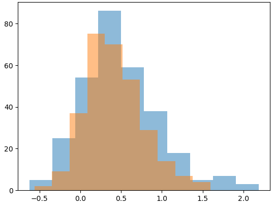
In order to provide distributions to compare, I chose to use a skewed normal as a familiar but not quite standard distribution DS/ML practitioners may encounter in their jobs. I first generate random parameters for skew, center and scale of the distribution for the base distribution, and then modify each of those parameters by random value ±25% from the original. This gives a base and alternate distribution that we are treating as the original population, and one later in time.
We then sample each distribution a number of times to create our final histograms that will be reviewed by the user. For each set of samples, we can calculate the true PSI value and store it until the user has time to evaluate.
Evaluation Loop
When using the notebook, a single cell will show the plotted distributions against one another, but the true PSI value is not shown.
The user must then click on one of two buttons to label the two populations as having acceptable or unacceptable drift. After clicking, their evaluation and corresponding PSI value are logged to a list, and the process repeats by replacing the plot with two new distributions and their hidden PSI value.
The user can continue this process as many times as they like until they feel satisfied that they have provided enough sample data to work with.
Preference Estimation
What we have done here is created a labeled dataset that encodes the user’s intuition on how much difference in two distributions constitutes an unacceptable risk in terms of population drift. We then can learn a logistic regression model to quantitatively measure that relationship. I chose to use PyMC to build the model because of the small data sizes and noisiness in measurements (more below), but you could use anything. Once this model has been learned, we can plot our observations alongside the curve from our learned beta parameter to compare our expectations of how we feel about risk to the measured reality. You can take a look at my results in the following chart:
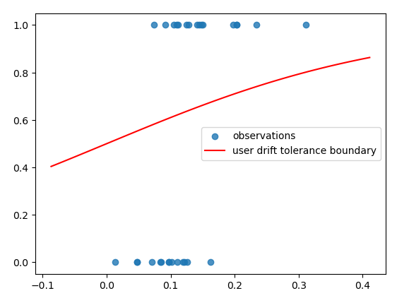
As we can see, this doesn’t look like your usual S curve. If we zoomed out significantly, we would see the shape, but as is, due to overlap between our labels, our model doesn’t have the nice, clear-cut decision boundary we were hoping for.
Conclusions
- Drift is subjective from person to person, and maybe even more so within an individual. Humans are bad at probability and most visual mathematical intuition that exceeds a few data points.
- Reliance on industry benchmarks without appropriate supporting data can leave you and your organization vulnerable to hidden mistakes and overconfidence.
- Folks working in the data industry need to challenge assumptions and if datasets do not exist, seek them out or curate them yourself.
I can imagine that going through this exercise with key members of your model validation/risk management leadership may prove insightful, and if you want to get even fancier, it might be fun to build a hierarchical logistic model to capture the risk preference of the organization overall as well as being able to compare individuals’ preferences.